User Experience and Accessibility: The Complete Guide
User experience and accessibility — The Complete Guide: User experience and accessibility are the same product problem with two goals: make the interface…

Wheelchair accessibility symbol painted on pavement
Last updated: November 17, 2026
User experience and accessibility are the same product problem with two goals: make the interface easy to use, and make it usable by people with different bodies, devices, and methods of input. The fastest way to improve both is to design for clear paths, visible states, readable content, and keyboard support from the start.
Key takeaways
- Accessibility is not a separate layer added at the end; it changes the shape of the whole product.
- Good UX reduces friction for everyone, while accessibility removes barriers for people who are often blocked first.
- A page can look polished and still fail badly if labels, contrast, focus order, or error messages are weak.
- WCAG gives the clearest common standard, but it does not replace human judgment about real use.
- The best accessibility work protects people from dead ends: missing labels, lost focus, vague buttons, and text that cannot be read or zoomed.
What are user experience and accessibility?

User experience is how a person feels while using a product, and accessibility is whether that product can be used at all by people with different needs. A smooth checkout, a clear menu, and a readable article are UX wins; a form that works with a keyboard, a screen reader, and high zoom is an accessibility win.
The two overlap more than many teams admit. A confusing label is both a UX problem and an accessibility problem, because it slows sighted users and blocks assistive tech users. A bad focus order, a tiny tap target, or low contrast can turn a “nice-looking” interface into a dead end.
This is why accessibility should not be treated as a special project. It belongs in the same design, content, and QA process that handles layout, navigation, and copy. If the product has 1 homepage, 12 templates, and 200 content pages, every one of them needs the same core rules.
The practical standard most teams use is WCAG 2.2 from the W3C. It gives testable success criteria such as 1.1.1 Non-text Content, 2.4.7 Focus Visible, and 3.3.1 Error Identification. Those numbers matter because they turn “make it accessible” into a checklist a team can actually review.
Links: W3C WCAG 2.2 and WAI Overview
Why do UX and accessibility belong together?
They belong together because the same design flaws hurt both groups, just in different ways. A site with buried navigation, vague buttons, and unreadable text wastes time for everyone, but it can also block a person using a screen reader or keyboard.
One useful way to think about it is that UX asks, “Can people finish the task?” Accessibility asks, “Can more people finish the task without extra barriers?” Those are not competing questions. A product that answers both usually has better structure, cleaner copy, and fewer support problems.
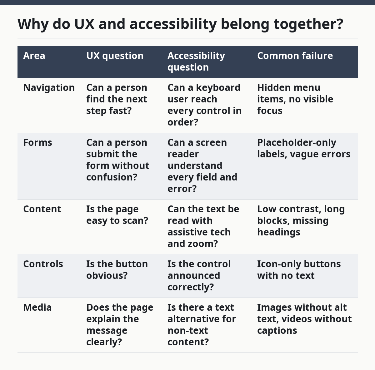
Here is the difference in plain terms:
| Area | UX question | Accessibility question | Common failure |
|---|---|---|---|
| Navigation | Can a person find the next step fast? | Can a keyboard user reach every control in order? | Hidden menu items, no visible focus |
| Forms | Can a person submit the form without confusion? | Can a screen reader understand every field and error? | Placeholder-only labels, vague errors |
| Content | Is the page easy to scan? | Can the text be read with assistive tech and zoom? | Low contrast, long blocks, missing headings |
| Controls | Is the button obvious? | Is the control announced correctly? | Icon-only buttons with no text |
| Media | Does the page explain the message clearly? | Is there a text alternative for non-text content? | Images without alt text, videos without captions |
The best part is that accessibility often improves metrics that product teams already care about. Clear headings help scanning. Better labels help conversion. Strong contrast helps reading on bright screens. None of that is extra decoration.
The warning is just as important: not every visual flourish helps. A style that depends on color alone, motion alone, or hover alone may look modern and still fail users who cannot see the color difference, avoid motion, or use a keyboard. If a feature only works under one condition, it is fragile.
What standards should a team follow?

A team should use WCAG 2.2 as the main standard, then map it to any local law or sector rule that applies. WCAG gives the clearest shared language for web accessibility, while laws and procurement rules decide what must be met in a specific place.
The reason WCAG matters is that it covers the core problems that show up again and again: text alternatives, keyboard access, color use, structure, input assistance, and predictable interaction. The current version is WCAG 2.2, which builds on earlier WCAG 2.x guidance and adds more support for low vision, keyboard users, and people with limited pointer control.
There are other standards that may matter too. EN 301 549 is widely used in public-sector and procurement settings in Europe. Section 508 matters for U.S. federal work. ARIA 1.2 matters when native HTML is not enough, but ARIA should support semantics rather than replace them. That last point is a common trap: ARIA can help, but native HTML usually gives better results with less risk.
The safest rule is simple: use HTML first, ARIA second, custom code last. A real button should be a <button>, not a styled <div>. A real link should be a link. A heading should be in heading order, not a bigger font with no semantic tag. When a team skips those basics, the cost often shows up later in testing, bug fixes, and support tickets.
How do you design for both from the start?
You design for both by making the structure obvious before the visual polish begins. The first pass should decide headings, landmarks, labels, error states, and keyboard flow before anyone debates shadows, gradients, or animation timing.
A strong layout starts with predictable structure. Users should know where the navigation is, where the main content begins, and where the page ends. Headings need a logical order, not a random one. If a page jumps from H1 to H4 because it “looks better,” the outline becomes harder to follow for assistive tech and for people scanning the page.
Controls need names that match the task. “Submit,” “Continue,” and “Save changes” are clearer than “Go” or “Next” when the user must know exactly what happens. Icon-only controls need text alternatives. A search icon, a close icon, and a menu icon are common examples where the visible image is not enough by itself.
The same rule applies to states. Hover can be useful, but it cannot be the only signal. Focus must be visible. Selected, expanded, pressed, and disabled states all need clear treatment. A product with 20 interactive elements and only 1 visible focus style is not finished; it is half-usable.
Here is a simple before-and-after comparison that shows what changes in practice:
| Pattern | Before | After |
|---|---|---|
| Form label | Placeholder text only | Persistent label above the field |
| Button | “Go” on an icon-only control | Text label plus icon, or clear accessible name |
| Error | Red border with no message | Text message that names the problem and how to fix it |
| Heading | Large bold text with no structure | Proper heading tags in order |
| Focus | No visible keyboard focus | Clear focus ring on every interactive element |
This is also where design systems earn their keep. If a team has 14 button variants and 9 card styles, consistency usually breaks somewhere. A smaller set of tested components makes accessibility easier to maintain across 10 templates or 100.
What should content and copy do differently?
Content should do more than explain; it should remove guesswork. Clear content is a major accessibility tool because it reduces memory load, supports screen readers, and helps people who scan quickly or translate mentally as they read.
Short, plain sentences are easier to process than dense copy. That does not mean childish writing. It means direct writing. “Choose a file” is better than “Select your desired upload asset.” “Required” is better than a hint that appears only after submission. “Sign in” is better than a label that says “Proceed to authentication.”
Headings matter because many people do not read top to bottom. They jump by heading, landmark, link, or search. A page with useful headings gives the reader a map. A page with pretty but vague headings forces trial and error.
Links need specific text too. “Read more” on its own tells the user almost nothing out of context. “Read the WCAG 2.2 overview” or “See keyboard support requirements” gives a real destination. The same is true for button labels. The label should say what will happen, not what the design team wants it to sound like.
Images and media need direct text support. Alt text should explain the purpose of the image, not describe every visual detail by default. If an image is decorative, it should be treated as decorative. If a chart carries essential data, the data should also exist in text. If a video explains a process, captions and a transcript are not optional extras; they are the access path for many users.
What does testing actually catch?
Testing catches the gap between “looks fine” and “works for real people.” A page can pass a visual review and still fail keyboard use, screen reader use, zoom, contrast, or error handling.
The most useful checks are simple. Can every control be reached with Tab? Can the user see where focus is? Does the reading order make sense without a mouse? Do labels, instructions, and error messages survive with JavaScript off, zoom on, or a screen reader active? Those are the questions that expose real trouble.
Automated tools help, but they do not finish the job. They are good at spotting missing alt text, contrast failures, and some structural issues. They are not reliable at judging whether a button label makes sense, whether a custom component is announced correctly, or whether a task flow is confusing. That is why manual review still matters.
A good test pass usually includes a keyboard-only run, a screen reader review, a zoom check, and a quick pass through common forms. If a page has a modal dialog, a date picker, or a multi-step checkout, those need extra attention because they are common failure points. A modal that traps focus badly can break the page for everyone who cannot simply click away.
The real value of testing is not just finding bugs. It is learning where the design assumptions were wrong. If a team assumed the user would always see color changes, always use a mouse, or always read instructions before acting, testing will expose that assumption fast.
What are the most common mistakes?
The most common mistakes are small on paper and expensive in use. They include missing labels, weak contrast, keyboard traps, poor focus styling, unclear errors, and content that depends on visual cues alone.
Missing labels are a classic failure because they hide the field’s purpose from assistive tech. Weak contrast makes text harder to read in bright light, on low-quality screens, or for people with low vision. Poor focus styling causes keyboard users to lose their place. A keyboard trap stops progress entirely.
Another common mistake is treating accessibility like a final audit. By the time the product is “done,” the layout, copy, and code may all be locked in. Fixes then cost more, take longer, and are less likely to be complete. That is one reason teams who wait until the end often miss the same issues in the next release.
The last mistake is assuming accessibility is only for a small group. That mindset misses the larger UX payoff. Better labels help everyone. Clear structure helps everyone. Strong focus states help everyone who uses a keyboard, a switch device, voice input, or a laptop in a bright room. The goal is not a special version for a few users. The goal is a product that holds up under more real conditions.
Here are the trade-offs that matter most:
| Approach | Benefit | Cost or risk |
|---|---|---|
| Custom UI from scratch | Total visual control | More room for semantic mistakes |
| Native HTML components | Better built-in accessibility | Less design freedom without extra work |
| ARIA-heavy widgets | Can fill gaps in custom interfaces | Easy to misuse and break behavior |
| Automated-only QA | Fast and repeatable checks | Misses many real usability failures |
| Manual-only QA | Catches nuance and interaction issues | Takes more time and discipline |
This is the right place to say who the guide is not for. It is not for teams that want a one-time checklist and no maintenance. Accessibility is not a patch. If the product changes every week, the rules need to stay in the process every week.
How do teams make it part of the workflow?
Teams make it part of the workflow by assigning it to design, content, and development at the same time. If only one role owns accessibility, the work tends to arrive too late or stop at the easiest part.
The cleanest process starts early. Design reviews should check structure, states, and color use. Content reviews should check labels, headings, and link text. Development reviews should check semantic HTML, keyboard behavior, and accessible names. QA should verify the critical paths with both automation and manual checks.
A design system helps because it reduces the number of one-off decisions. If a button component already includes clear focus, text labels, and state changes, every new page inherits that work. If a form field already includes label, hint, and error patterns, the team does not have to solve the same issue 20 times.
Training matters too. A team does not need to memorize every WCAG success criterion to do better work. It does need to know the basics: use proper HTML, keep headings in order, do not rely on color alone, make focus visible, and write clear error messages. Those five habits catch a large share of avoidable problems.
Maintenance is the last piece. A page that is accessible at launch can drift as content grows, components change, and scripts get added. That is why accessibility should be part of release review, not a one-off event. If a team ships 4 updates a month, accessibility review should ship with them.
What does “complete” really mean here?
“Complete” means the product works across different ways of seeing, hearing, moving, and understanding, not just across different browsers. A complete UX and accessibility process checks structure, content, controls, media, and error handling together.
It also means the team knows where the edge cases are. A simple article may be easy to make accessible. A complex application with modals, dynamic updates, drag-and-drop, and nested forms is harder. That difference matters. The same checklist does not weigh every page equally, because the risks are not equal.
The honest standard is not perfection. The honest standard is whether the product is predictable, perceivable, operable, and understandable in the places that matter most. WCAG uses those four principles for a reason. They describe the failure modes that people hit again and again.
If a team wants one sentence to keep nearby, it is this: accessibility is what happens when good UX stops assuming one kind of user. That shift changes how interfaces are built, how copy is written, and how bugs are found.
FAQ
What is the difference between UX and accessibility?
UX is the broader experience of using a product, while accessibility is whether people with different abilities and input methods can use it without barriers. A feature can feel polished and still fail accessibility if it cannot be used with a keyboard, a screen reader, or zoom.
Is accessibility only for people with disabilities?
No. Accessibility helps people with disabilities first, but it also helps people in temporary or situational limits, such as low light, a broken mouse, a slow connection, or a bright screen. The same fixes often improve the product for everyone.
What standard should I start with?
WCAG 2.2 is the best starting point for web work because it gives clear, testable criteria. It is usually the first standard teams map to laws, procurement rules, or internal quality goals. For public-sector or regulated work, other rules may apply too.
Can automated tools make a site accessible?
No. Automated tools catch some issues, but they cannot judge every label, flow, or interaction. Manual testing is still needed for keyboard use, screen reader behavior, and task clarity. A good tool finds problems; it does not finish the job.
Do I need to redesign everything to improve accessibility?
No. Many improvements come from better labels, cleaner structure, visible focus, stronger contrast, and clearer error text. Those changes can start small and still make a real difference. A full redesign is not required to make the first useful gains.
Drafted with AI; not yet reviewed by a person.