Site Structure and Navigation: The Complete Guide
Site structure and navigation — The Complete Guide: use a clear hierarchy, a small top menu, and 301 redirects when pages move. This article, Site…

Person sketching a website structure diagram on a whiteboard
Last updated: November 16, 2026
Quick answer: use a clear hierarchy, a small top menu, and 301 redirects when pages move. This article, Site Structure and Navigation: The Complete Guide, shows how to make pages easy to find, easy to understand, and easy to move between. If a visitor cannot tell where they are within a few seconds, or cannot reach an important page in a few clicks, the structure is working against them.
A good setup uses clear page groups, plain labels, and a menu that matches what people actually need. For accessibility and usability, the standards that matter most here include WCAG 2.2 from the W3C and the navigation guidance from Nielsen Norman Group. For related planning work, see our information architecture guide and site audit checklist.
Key takeaways
- Structure is the map; navigation is the path people use to move through that map.
- Flat is usually better than deep when the site is small enough to keep important pages close to the home page.
- A menu works only when its labels match the words visitors use, not internal team jargon.
- Breadcrumbs, footer links, and internal links do different jobs, so one cannot replace the others.
- The strongest site structure supports users first, then search engines as a result.
What is site structure?

Site structure is the way your pages are grouped and connected. It answers the question, “What lives where?” and it usually shows up as categories, subcategories, child pages, and the links between them.
Think of it as the site’s filing system. A clean structure lets a visitor understand the site in seconds, while a messy one buries useful pages under vague folders such as /resources/ or /misc/. For a content-heavy site, the structure often matters more than the design skin because it controls how fast people can reach the page they want.
A strong structure also helps search engines interpret relationships between pages. A page linked from a main category, a breadcrumb trail, and related articles is easier to place in context than one left floating alone at the bottom of a long archive. That context matters even when the page title is good.
The biggest mistake is to treat structure as an afterthought; in many cases, you should consult a professional information architect or UX specialist before launch. NNGroup’s guidance on site sections and navigation explains why early planning matters, because late fixes often create duplicate topics, orphan pages, and names that mean different things in different menus.
What is navigation?
Navigation is the set of links people use to move through the site. It includes the main menu, submenus, breadcrumbs, footer links, contextual links inside articles, and search when the site is large enough to need it.
Navigation is not the same as structure, even though the two are tied together. Structure is the logic behind the pages; navigation is the visible system that exposes that logic to the visitor. A site can have a sound structure and still have bad navigation if the labels are vague, the menu is too crowded, or the important pages are hidden behind hover states that fail on mobile.
The main menu should answer the first question a visitor has: “Where do I go next?” The footer should answer the second question: “What else is important but did not fit above?” Breadcrumbs answer: “Where am I in this site?” Each one earns its place by doing a different job.
Good navigation also respects device limits. A desktop menu with ten top-level items can still be hard to use on a phone if it turns into a wall of nested panels. Mobile navigation needs fewer choices, shorter labels, and a clear way back.
Flat or deep structure: which one is better?
A flatter structure is usually better for smaller sites, while a deeper structure is often necessary for large sites with many distinct topics. The right choice depends on how many pages you have and how often visitors need to compare related content.
Here is the practical difference:
| Criteria | Flat structure | Deep structure | Winner for this condition |
|---|---|---|---|
| Number of top-level categories | Few, broad categories | More levels under each category | Flat for small sites |
| Time to reach key pages | Shorter path | Longer path | Flat for fast access |
| Topic clarity | Can get vague if categories are too broad | Can keep topics tightly grouped | Deep for complex subject areas |
| Menu simplicity | Easier to keep clean | Easier to overload if not controlled | Flat for simple sites |
| Scaling to many pages | Gets messy sooner | Handles more content | Deep for large libraries |
| Use on mobile | Usually easier to scan | Can become buried in accordions | Flat for phone-first use |
| SEO context | Good if links are kept tight | Stronger topical grouping when done well | Deep for large topical clusters |
| User wayfinding | Easier to understand quickly | Better when the subject tree mirrors user intent | Depends on content breadth |
| Risk of orphan pages | Lower when pages stay near the home page | Higher if layers multiply without links | Flat for smaller teams |
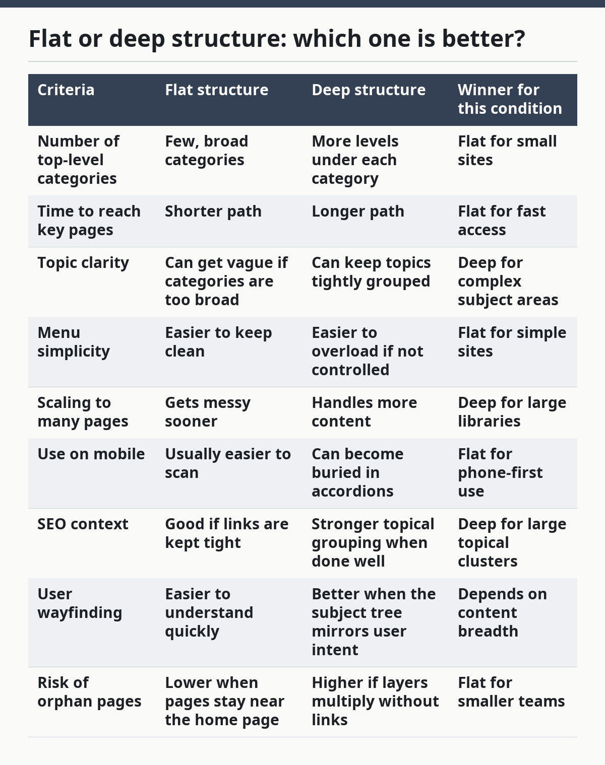
Flat structure wins when the site is small enough that a visitor should not have to guess where a page lives. That usually means a few core categories, each with a manageable set of subpages. If the structure turns into a long list of almost identical sections, flatness stops helping and starts hiding the real hierarchy.
Deep structure wins when the site covers a lot of material and the topics truly need layers. A knowledge base, a store with many product families, or a large editorial site often needs more than one level because a single menu cannot carry that much meaning. The downside is obvious: if the depth gets excessive, important pages become hard to reach and easy to miss.
My recommendation is simple: keep the structure as shallow as possible, but no shallower. That means every extra level should earn its place by making the content clearer, not by making the menu look tidy.
How should the main menu be organized?
The main menu should group the site’s most important paths, not every page that exists. It is the first place people look, so it should contain a small set of labels that make sense without explanation.
A strong menu usually starts with the broadest user goals. For example, a content site may use categories that reflect the visitor’s problem, while a product site may use categories that reflect product families. The label should match the reader’s words, not the internal department name. “Guides” is clearer than “Learning Center” in many cases, and “Support” is clearer than “Customer Experience” almost every time.
The main menu should also stay stable. If the top-level labels change every few weeks, people lose their sense of place. Stability matters because returning visitors build memory around where things live. A menu that shifts too often makes the whole site feel harder than it is.
Keep the number of primary items modest. A menu with too many equal-weight choices forces people to read every label before they can act, which slows them down. When there are too many top-level items, some of them belong in the footer or inside a subcategory rather than in the main bar.
What role do breadcrumbs and footer links play?
Breadcrumbs show location, and footer links catch the pages that do not fit in the main menu. They are not optional extras on a large site; they solve different problems that the top navigation cannot solve well.
Breadcrumbs help visitors understand where they are within a hierarchy. A breadcrumb trail such as Home > Category > Subcategory > Page gives orientation without forcing the user to open the menu again. It is especially useful on sites with more than one layer of content because it reduces the feeling of being lost.
Footer links handle utility and secondary paths. Contact pages, policy pages, archives, and other low-priority destinations often belong here. The footer should not become a second main menu, though. If every major page is pushed into the footer, the site is quietly admitting that the main navigation is too crowded or too vague.
Breadcrumbs and footer links also help with accessibility and scanning. A visitor who jumps into the middle of a site from search may not begin with the home page, so these secondary paths matter more than teams sometimes expect. A breadcrumb trail built with proper HTML and clear labels does more than decorate the page; it gives the user a quick way to back up a level.
What does bad navigation look like?
Bad navigation looks like a menu that makes the visitor work too hard. The signs are easy to spot: vague labels, too many choices, hidden submenus, duplicate links, and pages that cannot be reached from anywhere important.
One common failure is jargon. If the site uses internal terms such as “solutions,” “verticals,” or “platform” without explaining them, visitors have to guess where to click. Another failure is over-nesting. When the user must open three layers of dropdowns before reaching a useful page, the menu becomes a maze instead of a guide.
A worse problem is inconsistency. If a page appears in the main menu in one section, in a sidebar in another, and nowhere else on mobile, the site feels unreliable. That inconsistency is especially painful on phones, where a long interaction chain is more frustrating than on desktop.
Broken links and dead ends do real damage too. A navigation system should not send people to pages that no longer exist, and it should not strand important content without a route back. Redirects such as 301s matter here because they preserve the path when pages move.
Which navigation patterns actually help users?
The best navigation pattern is the one that fits the site’s content and user goals, but a few patterns work better than others for most sites. For a content site, a clear top menu plus breadcrumbs plus strong in-article links is usually enough. For a large catalog or resource library, category filters and search become much more important.
Top navigation works best when the user needs to choose a broad lane first. Side navigation is useful when there are many sibling pages under one section. Search helps when the catalog is too large for menus alone, but it should not be used as a patch for poor structure. If people can only find things by typing exact names, the site has already failed at wayfinding.
A good pattern is one that matches the content model. If the site has a few major categories and a limited number of important pages, keep the interface simple. If the site has hundreds of pages, add tools that let users narrow the field without losing context.
Here is the honest trade-off: every extra navigation tool adds choice, and every choice adds cognitive load. A site with too many menus, filters, and links can feel busier than it is useful. The goal is not to expose every possible path; it is to expose the right paths at the right time.
How does site structure affect SEO and accessibility?
Site structure affects SEO and accessibility because both depend on clarity. Search engines need a crawlable hierarchy, and users with assistive technology need labels and landmarks that make sense on the page.
For accessibility, the current benchmark is WCAG 2.2, which emphasizes predictable navigation, clear focus order, and content that can be used without relying on one device or one input method. That matters for menus, skip links, heading order, and the way dropdowns behave. If a menu only works with a mouse hover, it creates problems for keyboard users and many mobile users as well.
For SEO, clear internal linking helps search engines understand which pages matter most and how topics connect. A strong structure makes it easier to surface cornerstone pages, cluster related content, and avoid wasting crawl attention on useless paths. This is not about tricking search engines; it is about giving them a map that matches the site’s real hierarchy.
The trap is to think that SEO and accessibility are separate projects. They overlap in more places than teams expect. A readable label helps both a person and a crawler. A logical hierarchy helps both orientation and ranking signals. The same clean structure often supports both goals at once.
When should you change the structure?
You should change the structure when the site no longer matches how people actually use it. That usually shows up in search logs, support questions, repeated misclicks, or pages that have become important but still sit too deep in the hierarchy.
A restructure is worth considering when categories no longer fit the content. If one section has grown so large that it contains several different topics, or if two categories keep attracting the same pages, the old map is probably doing more harm than good. A redesign is also justified when the menu has become a dumping ground for every new page the team wants to promote.
The cost of change is real, though. Reworking structure can break old links, confuse returning visitors, and force redirects. That is why a structure should not be rewritten just because someone wants a fresh homepage layout. The reason must be functional, not cosmetic, and the change should improve how the site structure and navigation support real tasks.
A good rule is to change only when the current path creates repeated friction. If visitors can still find the main content without detours, the structure may need only smaller fixes such as renamed labels, better internal links, or a cleaner footer.
What should a site structure plan include?
A site structure plan should include page groups, page priority, link paths, and naming rules. Without those four pieces, a navigation rebuild becomes guesswork.
Start with the major page families. Group pages by purpose or topic, then decide which pages belong at the top level and which belong one level down. Next, mark the pages that must be easy to reach from the home page, because those are the pages the structure must protect first.
Naming rules matter just as much as the tree itself. A category name should be short, specific, and stable. If two people would choose different words for the same section, the label probably needs another pass. That is why teams often benefit from a controlled vocabulary rather than a free-for-all of page names.
The final plan should show how people move between sections. A structure that looks neat on paper but leaves no route between related topics will still fail in practice. The site needs both a hierarchy and cross-links, especially when a page can answer more than one kind of question.
How do you know if the navigation is working?
The navigation is working when people can find what they need without guessing, backtracking, or hunting through unrelated pages. That is the simplest test, and it is more useful than any decorative checklist.
You can tell a lot from the path itself. If common tasks require several detours, the structure is too deep or the labels are too vague. If users keep landing on the wrong section, the menu is speaking a different language from the audience. If the footer gets more attention than the main menu, the primary navigation is probably underperforming.
Analytics can support the judgment, but the structure should not depend on a dashboard alone. A page can receive traffic and still be difficult to reach. A menu can get clicks and still be confusing. The real measure is whether the visitor reaches the right page with minimal friction.
One strong sign is that internal links feel obvious in hindsight. When the site is structured well, the next page makes sense before the user clicks it. That feeling is not accidental; it is the product of a hierarchy that mirrors the way people think about the subject.
What is the verdict?
Choose a flat structure if the site is small enough that important pages can stay close together without turning the menu into a mess. Choose a deeper structure if the site has many distinct topic groups and needs clear layers to keep them organized. Neither if the site is still changing so fast that any structure will be obsolete in a month.
The right choice is the one that keeps the path short, the labels plain, and the top-level menu focused on real user goals. If a page matters, it should not feel hidden behind three doors. If a category is unclear, the structure is the problem, not the visitor.
What if the site has both articles and product pages?
The structure should separate the content types, but the navigation should let them support each other. A reader who starts with an article may later need a product page, and a shopper may need a guide before buying.
This is where cross-links matter. A site that keeps articles, products, and support in totally separate silos can trap visitors in one lane. A better setup keeps the top-level categories distinct while linking between them where the user’s task demands it. A product page can link to a guide, and a guide can link to the relevant product or category page.
The risk is overlinking everything to everything else. That creates confusion and weakens the meaning of the hierarchy. Use 301 redirects when content moves, but keep the visible navigation tidy and purposeful.
What if the menu is already crowded?
The answer is to remove, group, or demote items until the top level reflects what matters most. A crowded menu is usually a symptom of a site trying to promote too many things at once.
First, cut any item that does not deserve a top-level spot. Then group related pages under a stronger category. If a page is important but not central, move it to the footer or place it inside a subcategory rather than keeping it at the top for visibility’s sake.
The drawback of pruning is that some stakeholders will resist losing their preferred link, but the site structure and navigation should be judged by visitor needs first. The menu is not a directory of internal preferences; it is a guide for visitors. A cleaner structure usually performs better because it reduces scanning time and makes the next step obvious.
What if the site is mostly mobile traffic?
The navigation should become simpler, not more ambitious. Mobile screens punish long labels, wide menus, and complex hover behavior, so the structure has to do more of the work.
This usually means fewer top-level items, more careful grouping, and a stronger reliance on clear hierarchy. A mobile menu should not force people through layers that could have been avoided. Breadcrumbs and in-page links become more valuable because they provide quick orientation without demanding a large tap target.
The downside of designing only for mobile is that desktop users may lose useful context if the menu becomes too minimal. The fix is not to add everything back in. The fix is to keep the hierarchy clear and use secondary navigation wisely.
FAQ
How many levels should a site structure have?
A site should have as few levels as it needs and no more. For most sites, the goal is to keep important content close enough that people do not lose track of where they are, while still grouping related pages in a way that makes sense.
Is a mega menu always a bad idea?
No, a mega menu is not always a bad idea. It can work on a large site with several clear categories, especially if the labels are plain and the columns are well organized. It becomes a bad idea when it tries to show too much at once or when it hides the simplest path to the most important page.
Do breadcrumbs help SEO?
Breadcrumbs can help SEO because they clarify hierarchy and internal links, but they help users first. Their main value is orientation, especially on sites with more than one level of content and on pages that may be reached from search rather than from the home page.
Should every page be in the main menu?
No, every page should not be in the main menu. The main menu should hold the site’s most important paths, while less central pages belong in submenus, the footer, or internal links inside related content.
What is the fastest way to improve navigation without redesigning the whole site?
A fast fix is usually better labels and better internal links. Renaming vague menu items, adding breadcrumbs, and linking related pages inside content can improve wayfinding without rebuilding the entire structure.
Drafted with AI; not yet reviewed by a person.